ShopDreamUp AI ArtDreamUp

Deviation Actions


Description
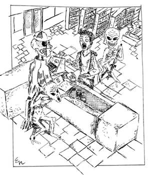
It's time for a 3rd upload of a series of 6 finished pages previews. I call them previews because inks, and eventually colours, are still to follow.
By now this page is already complete. The crowd at the top panel (and the band on the stage) + their reflexions on the marble floor have been added. The pattern on Felix coat is finished, and a few corrections here and there are done.
If you look for my second journal entry on my main page, you'll read a short synopsis of chapter 1.
On this page here we have an inauguration party where the main characters will mingle, friendships will be formed, and some threats issued...
Copyright Miguel Ferreira 1999-2014
Image size
7008x9912px 27.64 MB
© 2014 - 2024 LewisMichael
Comments7
Join the community to add your comment. Already a deviant? Log In
Okay! Let's begin! Shall we?
Vision is 4/5 stars. It looks okay. I'm not a fan of the chins, but it definitely emulates your style, and in this case, I think it works. It reminds me of one of those old art styles that you see in museums, which, in this case, is a good thing. The backgrounds are also very solid. They work in your favor and don't at the same time, but i'll get to that in technique.
Originality is 5/5. It seems to have this majestic style to the page. I'm not sure exactly how to describe it either. it's not like a Victorian era style or something like that, but it faintly reminds me of it. However, here, it looks pretty good. It makes me wonder how it would look if it was inked.(which I hope you do)
Technique is 4.5/5 stars. Very good art style(though i'm not a fan of it) It compliments the picture very well. your strokes also help with the backgrounds and facial expressions. However, it does hurt you a bit.
I think you should study anatomy and clothes a bit more. They look okay, but some of them don't(like at the bottom right-hand corner with the lady). I'm not sure if you plan something with that, but I hope you do.
Also, the background(albeit good) are kind of stiff. Don't be afraid to add some texture or marks to it, to show the age of the building. A little detail goes a long way.
Impact is 5/5 stars. it shows that you worked really hard on this. I can definitely picture a story with this! If you do plan to make a story, I plan to follow it. The art style makes it seem very interesting.
Either way, hoped this helped a little!